The Map Lied to You: Africa Is Bigger Than You Think
The world map most people grew up with distorted Africa’s true size. Here is how the Mercator projection reshaped global perception and why Africa is far bigger than you think.
Growing up indoors, with no access to a device and epileptic power supply that made torchlight an essential, you read anything with words on it.
The cereal box. The back of a paracetamol pack. Even the world map printed at the back of your mum's newest edition Oxford dictionary wasn't safe.
You stared at the country names and sizes with the kind of intensity reserved for exam papers, quietly building a mental picture of the world.
What you didn't know is that the continent housing your country had been quietly shrunk, flattened and tucked into a corner like it didn't matter. You were building your worldview on a lie.
The Map You Know Is Not the Map That Is
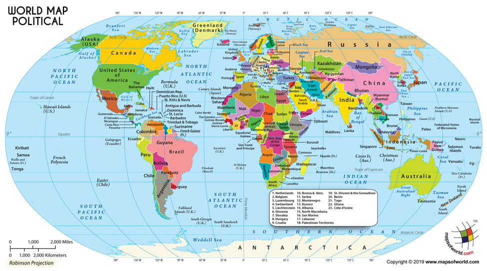
The world map most people have seen — in textbooks, on classroom walls, in the background of international news broadcasts — is based on the Mercator projection, a cartographic system designed by Flemish geographer Gerardus Mercator in 1569.
It was built for sailors. Its entire purpose was to help European ships navigate the seas without veering off course. It was never meant to accurately represent the sizes of continents.
It, however, became the world's default map anyway, and in doing so, it quietly rearranged the planet's sense of importance.
The distortion is staggering when you actually look at the numbers.
Africa Is Enormous
Africa covers approximately 30.4 million square kilometres, making it the world's second-largest landmass.
On the Mercator projection, it appears roughly the same size as Greenland. In reality, Africa is fourteen times larger than Greenland, which covers only 2.1 million square kilometres.
The continental United States fits inside Africa about 3.5 times. China, India, the contiguous US, and all of Western Europe can fit inside Africa simultaneously, with room to spare.
This is a structural misrepresentation that has been in circulation for over four centuries.
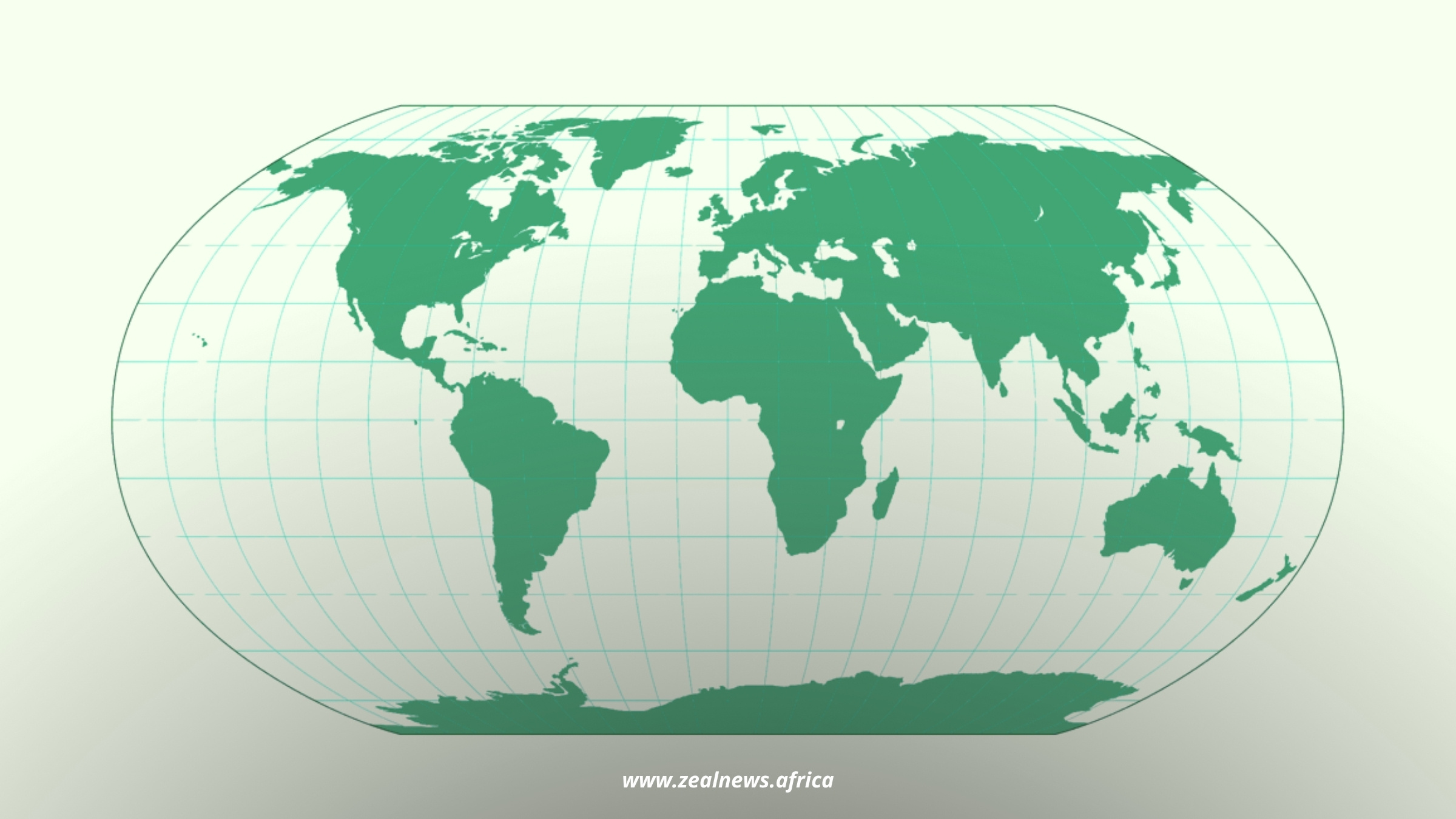
The Gall-Peters projection, introduced as an alternative in 1974, attempts to represent landmasses with accurate proportional size. On this map, Africa looks like itself — vast, central, dominant.
When the Boston Public School system switched to the Peters projection in 2017, students and teachers described genuine shock.
Culture
Read Between the Lines of African Society
Your Gateway to Africa's Untold Cultural Narratives.
The world they thought they knew looked different. Africa, which had always appeared peripheral, suddenly filled space the way it was always supposed to.
This Was Never Just About Geography
Maps are not neutral. Every map encodes a worldview, a set of assumptions about what matters, what is central, and what exists at the margins.
When Mercator placed Europe at the visual centre of the world and shrank the Global South, he was making a decision consistent with the political imagination of colonial Europe, where the continents being "discovered" and exploited were inherently lesser, smaller and peripheral to the civilised world at the top.
Research backs this up.
A 2020 worldwide study published in the ISPRS International Journal of Geo-Information, which surveyed over 130,000 people across eight languages, found that people who were most familiar with the Robinson projection, a map that represents landmasses more proportionally, estimated continent sizes significantly more accurately than those most familiar with the Mercator projection.

The researchers concluded that this directly points to the need for less distorted maps in educational materials and media.
In other words, the map on your classroom wall wasn't neutral. It was quietly shaping what you believed was true about the world.
What Shrinking a Continent Does to a People
When Africa is rendered as a manageable, reducible space, the size of, say, the continental US, it becomes easier to treat its crises as containable, its resources as minor, its billions of people as a footnote.
Cartography was a tool of colonialism. Making Africa look smaller made it easier to talk about Africa as though it were a country, a charity case, a problem to be solved by external hands rather than a continent of 54 nations, thousands of languages and thousands of years of civilisation.
This matters now because the maps haven't really changed. The Mercator projection is still the default onGoogle Maps.
It is still on classroom walls. It is still the image most people carry in their heads when they think about how the world is arranged.
Reclaiming the Map
Start by actually looking at a size-accurate map and sitting with the discomfort of how different it feels. Share it. Talk about it.
Because the distortion of Africa on a world map is not just a quirk of 16th-century navigation science — it is a symbol of a much older, much more deliberate project of diminishment.
The first step to undoing it is simply knowing that it happened. The continent was never small. It was just drawn that way.