Design Got Loud Again, and Spotify Was Just First to Admit It
Spotify’s bold new rebrand may signal the end of the post-lockdown minimalism era. From fashion to beauty to digital design, loud aesthetics and maximalism are returning after years of beige restraint and “quiet luxury.”
Something happened after the lockdown. The world lost its colour.
Makeup became "no-makeup makeup." Fashion went quiet with neutral tones, clean lines, nothing that demanded too much of you. Art got sparse and design basically became flat.

Everything started to look the same, and the universal aesthetic currency became the appearance of not trying.
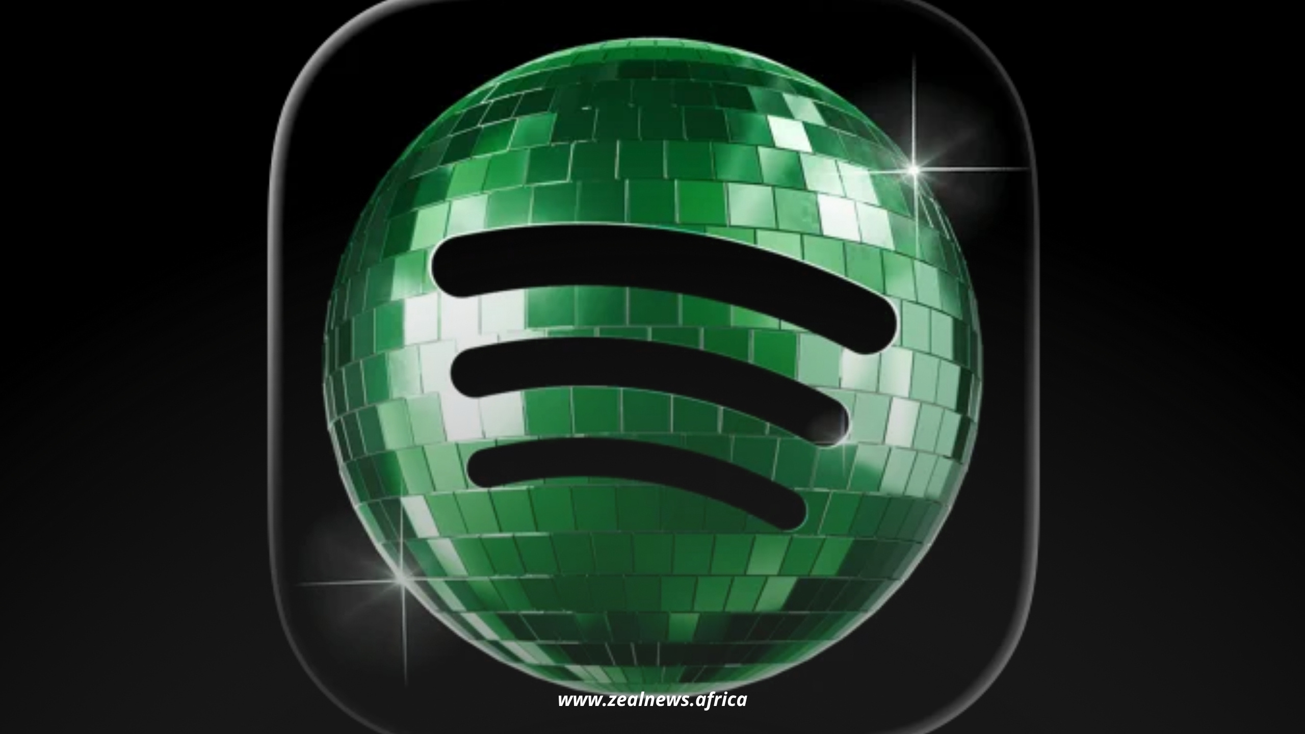
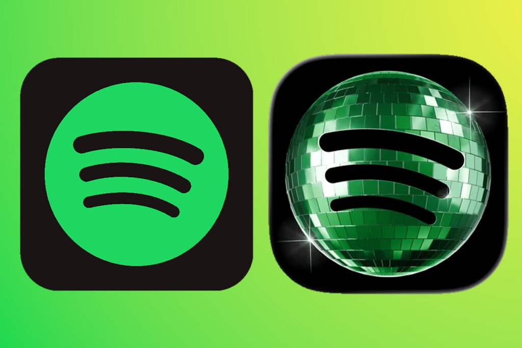
Then Spotify looked at its clean, inoffensive, paper-cut green circle and said: enough. Why are we whispering? Let's make some noise.
The rebrand dropped and people had a lot of feelings about it. The new logo which was bolder, warmer, the green now almost electric, was more of a statement than a colour upgrade.
A brand that lives entirely inside sound decided it was finally going to look like it.

The World Went Beige and Called It Sophistication
Post-lockdown minimalism made psychological sense. The world had just survived something overwhelming as a virus with collective grief and the quiet collapse of ordinary life attached. When everything outside felt chaotic and loud, the instinct was to create control wherever possible.
Interiors went white. Skin care replaced makeup (which is a good thing). Fashion buried colour under oatmeal and slate. Even the way people communicated online changed: understated, ironic, deliberately low-effort.
Design followed the same script. The web went flat.
Logos shed their shadows and gradients. Serifs disappeared.
Every major company seemed to hire the same design agency and receive the same sans-serif rebrand in return. From Airbnb to Pfizer to Burberry and even Jaguar, a brand built entirely on heritage, tried to strip itself down to something that looked like a Gen Z tattoo concept.

The logic was that simplicity communicates confidence. Less clutter, more trust.
Restraint signals maturity. The brands that refused to simplify started to look busy, even desperate.
Minimalism Was Never Actually Neutral
The most convenient thing about the minimalism era is how seamlessly it hid behind taste.
Culture
Read Between the Lines of African Society
Your Gateway to Africa's Untold Cultural Narratives.
To prefer clean design was to be sophisticated. To like maximalism — colour, pattern, layering, visual noise — was to be overwhelming.
The aesthetic became its own gatekeeping tool. The beauty industry rebranded it as "quiet luxury." Fashion called it "stealth wealth."
The message underneath was that excess is for people who do not know better.
But minimalism was never neutral. It carried a class code and a racial one too.
The "clean aesthetic" that dominated design studios for a decade borrowed heavily from cultures that had always used pattern and colour as storytelling, then repackaged restraint as the elevated alternative.

Spotify's rebrand quietly disrupts this hierarchy.
What the Logo Is Actually Saying
The new Spotify identity leans fully into energy. The green is saturated. The typeface has weight and personality. The visual language is playful without tipping into childish.
If the old logo said "we are a utility you can trust," the new one says "we are the reason the pre-party started."
And that is a branding decision that mirrors the audience, not just the product. This is a distinction that matters more than most companies want to admit.
Branding has always been a dialogue between a company and the people it wants to move. The brands that survive generational shifts are the ones that read when the conversation has changed.
Spotify's core audience — millennials who grew up with it, Gen Z who inherited it — is not in its quiet era anymore. Pandemic stillness has metabolised into something restless.
People are dressing boldly again. Maximalist interiors are trending.
Statement makeup is back. The body is being decorated rather than minimised. Spotify read the room and moved first.
The Illusion Is Starting to Crack
The minimalism era is not dead, but its grip is loosening, and you can feel it everywhere if you are paying attention.
Fashion weeks are swinging back toward drama and embellishment. Bold lip colours have returned. Y2K maximalism is being absorbed into the mainstream .
Culture
Read Between the Lines of African Society
Your Gateway to Africa's Untold Cultural Narratives.
Younger buyers who grew up inside minimal spaces are actively rejecting them. They are decorating their walls loudly.
Design, like everything else, is cyclical. Spotify just decided to take the turn first.