The World Has Been Looking at the Wrong Map, and Nobody Thought to Question It
For over 450 years, the Mercator map has shaped global perception, shrinking Africa to the size of Greenland in the global imagination. The African Union’s “Correct The Map” campaign is now challenging a distortion nobody formally created, but generations quietly inherited.
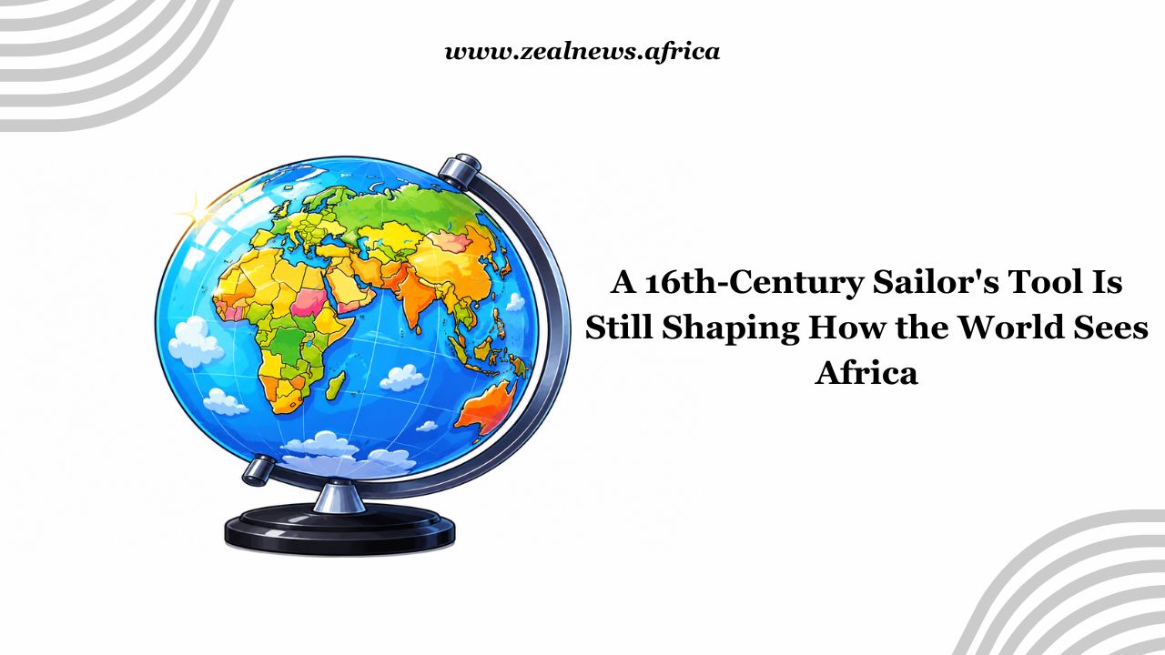
Kofi was nine years old the first time he saw a world map on his classroom wall in Accra. He studied it the way children usually do, with total belief and full curiosity.
He noticed that his continent, the one his teacher called home to over 1.5 billion people, looked roughly the same size as Greenland. He did not know where Greenland was, he just knew its position on the map.
But it looked big and important on the map. Africa, where he lived, looked average. He filed that away without knowing he was filing it. That map is still on the wall being used in his school.
A Tool That Outlived Its Purpose
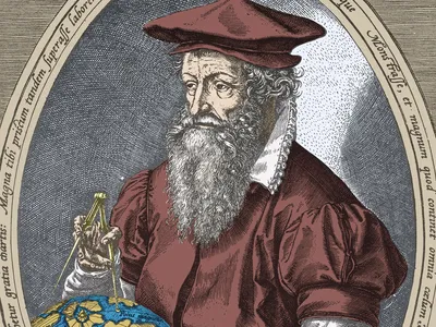
In 1569, a Flemish cartographer named Gerardus Mercator published a world map with a very specific purpose. The full Latin title translates roughly to: a new and augmented description of Earth corrected for the use of sailors.
The key word there is sailors, the map was originally intended to be used by sailors and not for description of continental size.
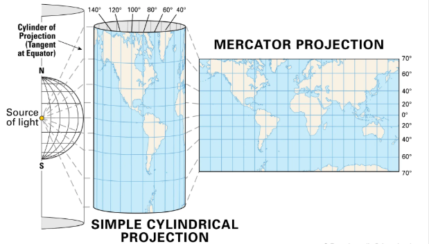
Mercator's projection solved a real technical problem, how to draw a curved planet on a flat surface in a way that let navigators plot a straight compass course without recalculating their bearing at every turn. For that narrow, practical purpose, it was brilliant.
The way it worked was mathematical but consequential: to keep lines straight, Mercator had to stretch the latitude lines farther apart as they moved away from the equator.
The further north or south you went, the larger the land appeared. Greenland, sitting near the Arctic, inflated to roughly the same visual size as Africa. The United States ballooned and Russia expanded across what seemed like half the map.
Meanwhile, Africa, sitting close to the equator, immune to that inflation, stayed roughly its actual shape. The irony is that the continent least distorted in shape ended up most distorted in perception.
Mercator built a compass tool. What got built around it, quietly, over centuries, was something else entirely.
How a Navigation Chart Became a Global Fixture
By the 1700s, the Mercator projection had expanded far beyond its intended maritime audience. Educators, publishers, governments, and eventually global institutions adopted it as a general-purpose world map.
This was done not because they tested it against alternatives or because it was the most accurate. It was largely because it was already everywhere, and what is already everywhere tends to stay.
Geographers have for decades pointed out that the Mercator map is an inappropriate choice for a world map in any context that is not about navigation.
The map's creator explicitly titled it 'for the use of sailors.' It was never designed to explain the relative importance or scale of continents to children or anyone for that matter.
Social Insight
Navigate the Rhythms of African Communities
Bold Conversations. Real Impact. True Narratives.
And yet, for generations, that is exactly what it did. School after school, atlas after atlas, the same distorted image repeated until it became the image people carried in their heads when they thought about the world.
Cartographer Tom Patterson, one of the creators of the Equal Earth projection, stated that: maps shape how we remember and understand the world, and misrepresentation in a projection can deeply influence how people see it, in misleading ways.
The word 'misleading' is precise because this was not a deliberate conspiracy to diminish Africa. But that does not mean it did not diminish Africa. Intent and outcome are different things.
The Size of the Thing Nobody Questioned
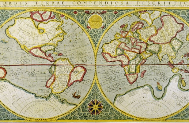
Africa is the second-largest continent on Earth. The United States, China, India, all of Western Europe, and Japan can fit inside its borders simultaneously, with room remaining.

Greenland, which sits at roughly the same visual size as Africa on the Mercator map, is in reality about fourteen times smaller.
These are not disputed figures. They are not contested geography. They are facts that most educated adults in the world would fail if asked to demonstrate on the standard classroom map.
That gap between reality and received image is the core of what the African Union's campaign on equal earth projection was built on and is all about.
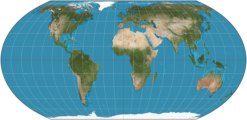
The AU, backed by advocacy groups Africa No Filter and Speak Up Africa, endorsed the Correct The Map campaign and called for a global shift to the Equal Earth projection, a standard developed in 2018 by an international team of cartographers that preserves accurate continental proportions.
Togo's Foreign Minister Robert Dussey buttressed on the institutional argument: a fair representation of Africa is essential for global awareness, education, and geopolitical understanding.
What sits beneath that formal language is something less diplomatic. A continent of 54 sovereign nations, with distinct governments, languages, histories, and economies, has spent centuries rendered as background geography.
A document listing China, Brazil, the UK, India, and Africa in the same breath, as though Africa is a single country joining a meeting of peer nations, reflects exactly the kind of flattened thinking that the Mercator image quietly reinforces.
That sentence is written in different governmental boardrooms and summits more often than anyone wants to admit.
What a Map Does to the Mind
There is a deeper conversation here that gets skipped in the policy framing. The Correct The Map campaign is not just asking for a different image in textbooks.
It is acknowledging something that psychology and education research have long documented: visual representations of scale influence how people unconsciously assign importance.
Social Insight
Navigate the Rhythms of African Communities
Bold Conversations. Real Impact. True Narratives.
When a continent appears small on the foundational document through which children learn where they exist in the world, that smallness attaches to everything associated with it. Markets, ideas, leadership and even relevance.
Fara Ndiaye, co-founder of Speak Up Africa, said it directly: it shapes how we learn, how we imagine power, how we see ourselves. That is not a metaphor. It is a description of how internalized geography works.
Moky Makura, executive director of Africa No Filter, called the Mercator projection 'the world's longest misinformation and disinformation campaign.'
It is a sharp phrase, and it will make some people uncomfortable, because the map's origins were technical, not malicious. But Makura is not describing an origin.
She is describing an effect, one that has been reproduced across classrooms, newsrooms, policy papers, and global institution letterheads for over four centuries without serious interruption.
Google Maps only switched from Mercator to a globe view on desktop in 2018. On mobile, Mercator remains the default.
The World Bank says it is phasing out the projection. NASA and National Geographic have adopted the Equal Earth map. The UN has received formal requests to follow.
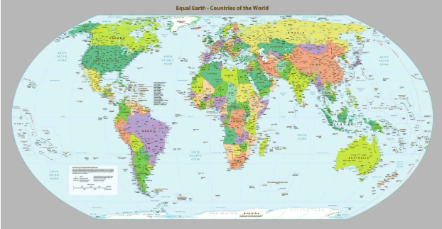
The pace of this shift tells you something. The institutions with the most to gain from an accurate map of the world are not racing to adopt one.
The AU's campaign is active but not yet loud. The UN resolutions are in motion but not resolved. The curriculum integration Speak Up Africa envisions, Equal Earth maps in African classrooms as the standard, is a goal, not yet a policy.
What exists right now is a formal challenge to something that was never formally decided. Nobody voted to make the Mercator projection the image of the world.
It just became that and things that just became the way they are tend to resist changing unless the people most affected by them push back with enough collective force that the alternative costs more than the status quo.
Kofi is not the only child who grew up with that map on the wall. The question is simply whether the next generation gets a different one.