London Lions rebrand to signify new beginning
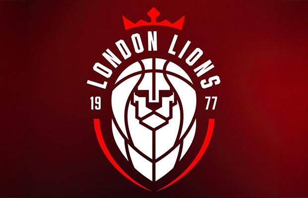
London Lions have announced a complete overhaul of their brand, including a new logo, marking a new chapter in the history of the club.
The revamp turns the page after two years of instability followed the fallout of previous owners and financial issues that left the club facing administration. The club has since rebuilt, stabilised and their attention is now “focused on its ambition to establish London as a global basketball powerhouse”.
London Lions CEO, Lenz C Balan, said: “This is such an exciting moment for everyone at the club.
“Thanks to all our supporters, staff and players over the past few years, we have been able to take huge strides off the court. Thanks to Ivan, from our content team, and the team over at False 9 for their work in creating our new look.
“We’re delighted to reveal this revamp that provides us with a fresh start and so much positive momentum currently behind us. We’re ready to take on Europe once again and continue our stadium development plans. And now we have a unified, visual identity that reflects this new chapter.”
The logo features a geometric lion’s face fused with a basketball, with a crown atop it, in stark contrast to the previous logo which received a lot of criticism when first revealed.
It maintains the club’s striking black, white and red colour palette, and the year 1977 – to mark the club’s founding – as a reminder of the decades of hard work and community that has led the club to this point, ready to be elevated into a new era.
The new bold designs will be present across kits, stadium signage and social content.
Recommended Articles
The Beginning of the Nuclear Bomb: An Oral History - NewsBreak

The men who set off the nuclear age tell the tale in their own words.
The movie AV experts use to test sound systems finally gets a 4K Blu-ray release
If you want to test your TV, surround setup or soundbar, this is the disc for you
Avid's first all-new turntable in 12 years is an $11k Relveo-lation | TechRadar

New suspension, a 'reimagined' platter and an advanced PSU too
'Cruising J-Town' museum exhibit spotlights a pivotal chapter in car culture

We suspect that many JNC readers were introduced to the wonders of Japanese cars during the Tuner Era of the late 80s an...
State offers tax credits for theaters | State News | salemnews.com

We recognise you are attempting to access this website from a country belonging to the European Economic Area (EEA) incl...
'Captain Planet and the Planeteers' Live-Action Series Set at Netflix

Netflix has set a live-action adaptation of 'Captain Planet and the Planeteers,' an animated superhero series from the '...
You may also like...
Diddy's Legal Troubles & Racketeering Trial

Music mogul Sean 'Diddy' Combs was acquitted of sex trafficking and racketeering charges but convicted on transportation...
Thomas Partey Faces Rape & Sexual Assault Charges

Former Arsenal midfielder Thomas Partey has been formally charged with multiple counts of rape and sexual assault by UK ...
Nigeria Universities Changes Admission Policies

JAMB has clarified its admission policies, rectifying a student's status, reiterating the necessity of its Central Admis...
Ghana's Economic Reforms & Gold Sector Initiatives
Ghana is undertaking a comprehensive economic overhaul with President John Dramani Mahama's 24-Hour Economy and Accelera...
WAFCON 2024 African Women's Football Tournament
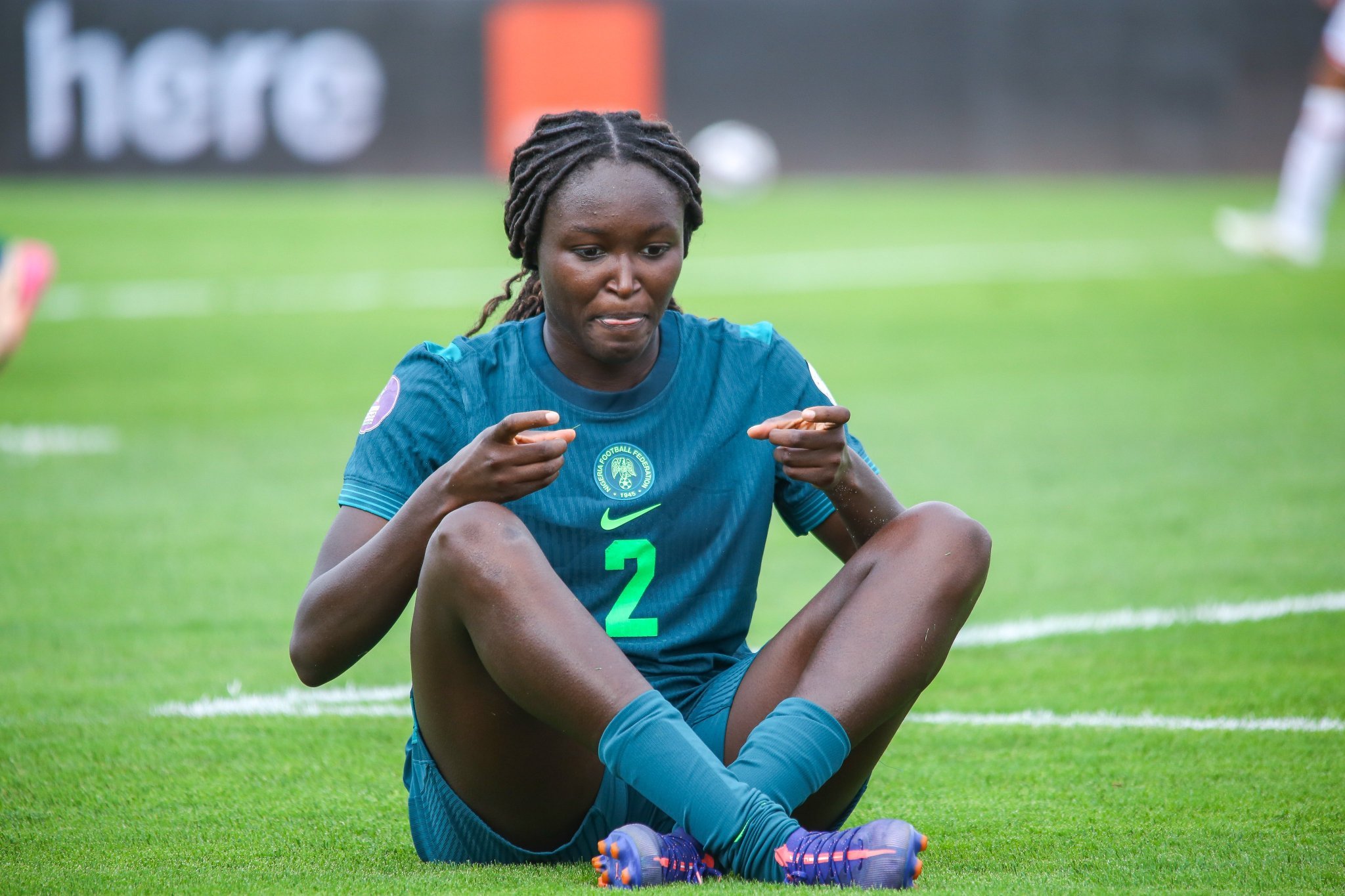
The 2024 Women's Africa Cup of Nations opened with thrilling matches, seeing Nigeria's Super Falcons secure a dominant 3...
Emergence & Dynamics of Nigeria's ADC Coalition

A new opposition coalition, led by the African Democratic Congress (ADC), is emerging to challenge President Bola Ahmed ...
Demise of Olubadan of Ibadanland
Oba Owolabi Olakulehin, the 43rd Olubadan of Ibadanland, has died at 90, concluding a life of distinguished service in t...
Death of Nigerian Goalkeeping Legend Peter Rufai

Nigerian football mourns the death of legendary Super Eagles goalkeeper Peter Rufai, who passed away at 61. Known as 'Do...