Google's Bold New Look: Iconic Tech Giant Unveils Major Design Overhaul!

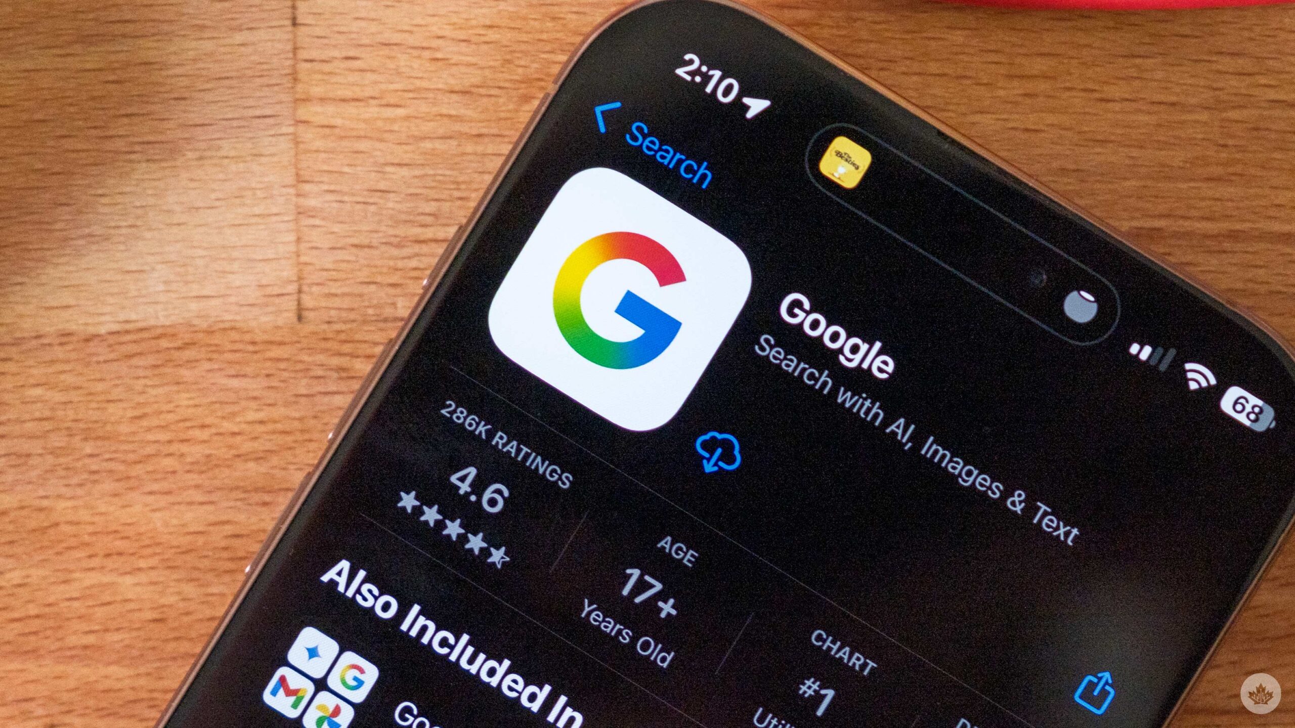
Google has unveiled a significant redesign of its company logo, marking the first major update to its primary visual identity in a decade. This refresh introduces a more radiant 'G' icon featuring a gradient color scheme that seamlessly blends its four iconic colors into a single, flowing transition. This new aesthetic departs from the previous fragmented, four-segment 'G' logo that was introduced in 2015, which aimed for a clean and simple, digital-friendly appearance.
The updated logo reflects Google's strategic move to align its broader brand with the visual language of its Gemini AI platform, which already utilizes a gradient color logo. This shift is intended to create a more cohesive visual experience for users as they navigate between Google’s diverse services, from search and productivity software to AI-related offerings. The smoother color transitions of the new gradient are also better suited for modern high-resolution screens and dark mode environments, which are now standard on most smartphones and laptops.
Initial tests of the new logo began earlier this year, with a limited rollout to users on both Android and iOS devices. Google confirms that this updated look will soon be implemented across all its platforms. This extensive rollout will encompass core services like Gmail, Drive, Meet, and Calendar, as well as Google Home, Google Nest products, and other hardware. Mobile app icons, browser tabs, and sign-in pages will also reflect the new branding, and Workspace users will gradually notice these changes across their productivity applications.
The transition will occur in phases, a typical approach for Google, allowing the company to thoroughly test updates and address any potential issues before a global launch. Consequently, some consumers may observe the new logo on certain products before others, and it's possible that both the old and new logos may appear concurrently for a brief period. Google has clarified that this redesign is purely visual and will not impact the performance, features, or functionality of its services. The company expects the full transition to take several months, with all updated logos appearing across services at some point this year, making it the most noticeable brand change from Google in years.
By adopting this clean gradient 'G,' Google aims to maintain color consistency across various screens, achieve greater uniformity across devices and systems, and facilitate simpler integration for future products and services within its expanding ecosystem.
Recommended Articles
Robots Unleashed: Google Makes Major Industrial AI Play Official

Alphabet-owned Intrinsic, focused on accessible industrial robotics AI, has officially joined Google, marking a strategi...
Google I/O 2024 Unveils AI's Next Frontier: Major Revelations Rock Tech World

Google I/O 2024 showcased the tech giant's profound commitment to AI, with Gemini AI deeply integrated across its major ...
EU Forces Google's Hand: AI Data Access Opens to Rivals
The European Union is taking steps to ensure Google provides rival AI companies and search engines with fair access to i...
You may also like...
Bold Claim! JJ Okocha Crowned More Skilful Than Messi, Ronaldo, and Neymar!

Nigerian legend Jay-Jay Okocha has been ranked the third most skilful player in football history, surpassing icons like ...
Shocking Revelation: Osimhen's Battle with Malaria Led to Heartbreaking Rejections!

Super Eagles striker Victor Osimhen shared his early career struggles, detailing rejections from two Belgian clubs due t...
Controversial WWII Film 'Rays and Shadows' Ignites National Fury in France!

Xavier Giannoli's "Rays and Shadows" has sparked a fierce national culture war in France, decades after "Lacombe Lucien"...
Explosive Michael Biopic: $15M Reshoots, Child Abuse Claims Erased, Sequels Teased!

The upcoming Michael Jackson biopic, “Michael,” faced significant changes during production due to a legal clause, leadi...
Lil Tjay's Explosive Return: Rapper Calls Out Offset After Posting Bond for Florida Shooting

Lil Tjay was released on bond after being charged with disorderly conduct following a non-deadly shooting involving Offs...
Anthropic Unleashes 'Mythos' AI for Cybersecurity Revolution!

Anthropic has introduced Mythos, its new frontier AI model, specifically previewed for cybersecurity applications throug...
Luxury Unleashed: BMW's 2026 i7 xDrive60, A High-Speed Electric Sanctuary

The 2026 BMW i7 xDrive60 emerges as a top-tier luxury electric sedan, masterfully blending effortless acceleration with ...
Experience Tomorrow: The Revolutionary AE.1 Atmos Lightship Redefines Living

Discover the innovative Lightship AE.1 Atmos, an all-electric pop-top travel trailer featuring a 77-kWh battery and the ...