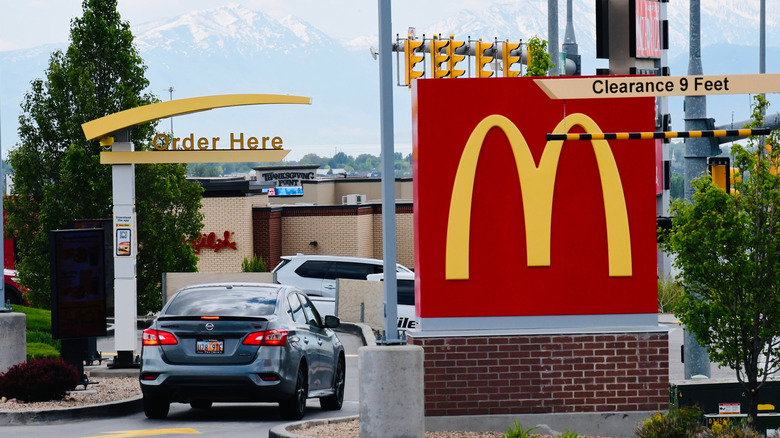
While red revs up your hunger, yellow brings feel-good vibes and evokes feelings of happiness and comfort. It's also one of the most visible colors from a distance, which is why McDonald's logo can be spotted from almost a mile away. Sure, there's an amazing story behind those iconic Golden Arches, which date back to 1961. However, choosing that sunny yellow may have been driven by science, not just style, because people tend to notice colors before shapes and remember them better. (One of the things many don't know about McDonald's is that more people recognize the Golden Arches than the Christian cross.)
The Sneaky Reason McDonald's May Have Chosen Red And Yellow As Its Colors
Published 1 day ago• 2 minute read
. Think KFC, Pizza Hut, and Chick-fil-A. The list is long. Most candies and snacks are also packaged in bold reds for the same reason.
Charles-McClintock Wilson/Shutterstock
Red and yellow aren't the only colors that evoke emotions associated with food. (For instance, green evokes feelings of health and freshness.) However, they're a magical combination that's a surefire way to lure customers. This pairing works especially well for quick-service restaurants like McDonald's because red encourages impulsive behavior, prompting people to pop in. It also makes you feel more excited and energetic. In contrast, yellow evokes feelings of comfort. Together, the two ensure that people come in for a quick bite, feel good about it, and leave just as quickly. The color scheme doesn't invite you to laze around or relax. Some also refer to this as the ketchup and mustard theory.
If you're wondering about the enormity of color's impact, it's quite huge. According to a 2006 study by Management Decision, people can make 62% to 90% of their snap decisions about products based on color alone. So, the next time you're driving past the Golden Arches and feel like grabbing a bite, think about whether you're genuinely hungry or if you've fallen for a psychological trick.
Loading...